Style In Externals
Description
This section is from the book "The Art Of Dispensing", by Peter MacEwan. See also: Calculation of Drug Dosages.
Style In Externals
The pharmacist, however, may lose all the pecuniary benefit of his conscientiousness if, after paying the best price for drugs, he should be deficient in style in sending them out. The dispenser who economises on his drugs is a rogue, but he who economises on his bottles, corks, pill-boxes, or paper is a fool. Customers can only judge by the externals, and generally they would be right in concluding that a man who sends out medicine in a low-class bottle with a brittle cork may have used drugs of equally low quality. Evidence of slovenliness on the outside of a packet does not encourage faith as to the care with which the contents have been compounded. Good taste may be shown in labels as well as in the boxes, bottles, etc, upon which they are placed. Let the direction to the patient, and not your own name and address, be the most prominent part of the label. Have a nice neat label for the dispensing department, with as little as possible upon it beyond your name, qualification, and address.
On this subject Professor Remington remarks that 'neatness, distinctness, and simplicity are cardinal principles in designing labels, and the reputation of many establishments is frequently judged from the character of the outward signs of neatness and care. For this reason particular attention should be paid to prescription-labels, not only to have the printed address plain, clear, and neat, but to have the handwriting to correspond. In these important particulars patients are exceedingly apt to form an estimate of the qualifications of the compounder of a prescription from the style of his penmanship, reasoning that if he is careful, clean, and neat in the one particular of which they are competent to judge- i.e., the handwriting on the label- the compounder must exercise similar qualifications in the more vital operations involved in compounding and dispensing, for upon the technicalities of the latter they cannot hope to pass judgment.'
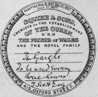
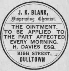
A Few Examples of Labels will serve to show both good taste in printing and the requisite elegance in writing the directions. The first specimen is a design which secured a first prize from The Chemist and Druggist for distinctness. This label exhibits with fair accuracy what an authority has put down as a cardinal principle in writing directions upon a label- viz., to balance the matter so that its parts may form a symmetrical arrangement. All the lines should begin and terminate at the same distance from the margin. If we write 'The Mixture' or 'The Powders,' we must take care that the words are in the centre, for the appearance of a label is greatly marred by having this superscription nearer to one side than the other. The dispenser should also be careful to adjust the matter so that it may fill the label fairly well. A label with a third of it at the top occupied by writing and the lower space blank looks bad. It is in this connection that a middling writer who has an eye for proportion in form may surpass a good writer in execution of a label.
The free-and-easy writer too often trusts so much to the excellence of his penmanship that he altogether neglects the proper apportionment of the parts of the directions.
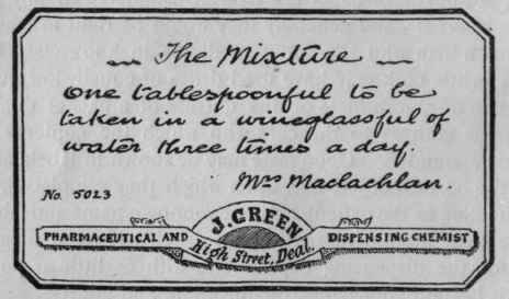
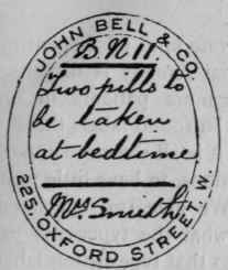
An Irish pharmacist, commenting upon this specimen (C. & D. xlviii. 75), remarked that it is a capital example of what a label should be, and he gave the useful hint that the writing should be allowed to dry, which recalls the fact that the best dispensers write the label for a prescription the first thing after reading it, and before they begin the compounding, so that the handwriting is dry and fast when the medicine is ready for the label. The most famous dispensing houses 119 George St., Edinburgh [119,Ge0rge St.,Edinburgh.] use exceedingly plain dispensing-labels. We are indebted to the principals of several establishments for the specimens which we give, the directions having been written by members John Bell & C&Deg; B.N Pharmaceutical Chemists,225, Oxford Street, Opposite Gt. Portland Street.
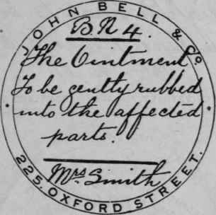

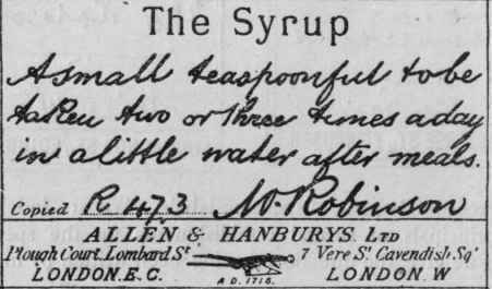
Of the staffs, but in the case of Messrs. Allen & Hanburys' label the writing on the original is in lithographic facsimile.
The following is a style of label which suits dispensing-businesses where the physicians' prescriptions are kept and filed, which is practically universal in the United States. The special advantage of the label is that when used on a square bottle the directions face the reader, and there is no possibility of complicating reference-matter with directions. We should prefer the label if it were turned round, bringing the blank lines parallel with the chemist's name, and instead of 'Directions' using the words 'The Medicine.'
The Mixture.
Richard H. Roe, graduate of the College of Pharmacy of the City of New York, 2047 Fourth Avenue, New York. | Directions : For.................................... Dose.................................... ........................................... ............................................ ............................................. | Prescription No........................................ Dr.............................................................. Date ............................................... 19 |
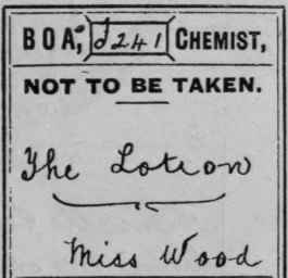
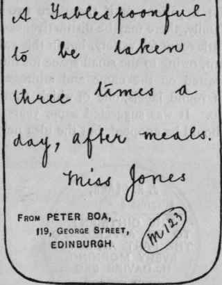
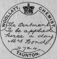
It is desirable to have more than one kind of dispensing-label, so that if more than one internal remedy is dispensed for a patient, or if there are two or more patients in one family, there may be distinctiveness. In round labels there is little room for variety, but in this case it is all the more important, owing to the small space for directions, to have little room wasted on the name and address. We give two specimens of round labels, one of which shows what the typewriter can do. It was suggested some years ago that typewritten labels should be adopted, but the idea never caught on:
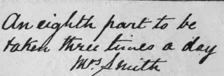
The foregoing examples show several styles of handwriting. The ability to write neatly is an essential part of the Minor candidate's qualification (see page 1). Bad penmanship is sometimes regarded as a sort of natural defect, and a good many people pride themselves upon it. Some perseverance, however, is all that is necessary to make a bad writer into a good one, and the youth who will not take the trouble to cultivate this first branch of his art had better abandon any thought of fitting himself to become a dispenser of medicines.
Labels should always be neatly trimmed by carefully cutting off with a pair of scissors the surplus paper at the margin.
Many pharmacists omit to do this, although it adds greatly to the ' finish' and elegant appearance.
The rare, but not unknown, practice of placing a fresh label over an old one to save the trouble of removing it should on no account be permitted. Apart from its slovenliness, such a habit may produce, and has produced, mistakes from the accidental removal of the top label and exposure of another unlike it in nature or dose. At any rate, the recognised rule in all good pharmacies is to take a clean bottle each time a prescription is dispensed. A customer now and then objects to his bottle being changed, but that is the exception which proves the rule.
'Poison,' 'Shake the bottle,' and other adventitious labels are best placed at the shoulder of the bottle. If placed at the foot, the hand holding the bottle may cover them, or a hurried person may overlook them: at the shoulder they will be read first. Moreover, it frequently happens that the patient will only tear off the upper part of the wrapper; hence a label at the bottom of the bottle in this case would be of no avail, because not seen. Another plan which is equally efficient, and neater, is to have 'poison' and 'Shake the bottle' printed on the labels. One series of lotion-labels may be had with 'Poison' at the top, and another series without. In the same way, mixture-labels may be had of two series- one with a plain 'The Mixture,' and the other with 'Shake the bottle before using' printed immediately below 'The Mixture,' or at the bottom of the blank space. Many dispensers, however, follow the practice of placing the 'Shake the bottle' label near the bottom of the bottle, on the principle that, being further away from the label with the direction, it is likely to receive distinct attention; and when it is necessary to use both a 'Poison' and a 'Shake' label on the same bottle, the latter placed at the bottom and the former midway between it and the label proper forms a distinctive and symmetric arrangement.
Orange-coloured paper is very commonly used for poison-labels, and is undoubtedly very distinctive; but it has the disadvantage that when used for oleaceous liniments the labels are apt to get stained, and the stains almost obscure the printing and writing. White paper with the border and name and address in red, and the wording 'Not to be taken,' or whatever it be, in black, makes a label free from this objection.
The Poison Regulations of Great Britain now require that embrocations, liniments, lotions, and liquid disinfectants containing poisons shall be sent out in bottles 'distinguishable by touch.' By this is meant one or other of the poison-bottles. The regulations are as follows :
Regulation I
That in the keeping of poisons, each bottle, vessel, box, or package containing a poison be labelled with the name of the article, and also with some distinctive mark indicating that it contains poison.
Regulation II
Also that in the keeping of poisons, each poison be kept on one or other of the following systems, viz.:
(a) In a bottle or vessel tied over, capped, locked, or otherwise secured in a manner different from that in which bottles or vessels containing ordinary articles are secured in the same warehouse, shop, or dispensary; or
(b) In a bottle or vessel rendered distinguishable by touch from the bottles or vessels in which ordinary articles are kept in the same warehouse, shop, or dispensary; or
(c) In a bottle, vessel, box, or package kept in a room or cupboard set apart for dangerous articles.
Regulation 3. - That in the dispensing and selling of poisons, all liniments, embrocations, lotions, and liquid disinfectants containing poison be sent out in bottles rendered distinguishable by touch from ordinary medicine-bottles, and that there also be affixed to each such bottle (in addition to the name of the article, and to any particular instructions for its use) a label giving notice that the contents of the bottle are not to be taken internally.
It is common to dispense lotions in flat bottles of green glass corrugated at the back, and embrocations and liniments in the hexagonal cobalt-blue bottles. If registered chemists and druggists and limited companies in Great Britain do not use these or other distinctive bottles for the medicines specified, they render themselves liable on conviction to a fine of 5/. for each offence. Registered medical practitioners are exempt.
Continue to:
My Books

